An eCommerce business needs to get a lot of things right in order to maximize its capacity to generate sales. From product design, to marketing, to shipment, there are innumerable boxes to check.
One aspect that doesn’t always command much discussion, however, is cultivating a valuable and appealing on-site experience.
Ultimately, this can be every bit as important as some other efforts that people tend to talk about more frequently.
While your company’s products and sales efforts will ultimately be most directly responsible for generating and maintaining business, the on-site experience you provide also plays a key role in attracting and intriguing customers.
A clumsy or unhelpful site — even with a tremendous product to sell — will cause site visitors to take their product search and shopping elsewhere.
On the other hand, an attractive and helpful on-site experience can be what pushes someone over the edge from browsing to buying — even if it doesn’t always happen on a conscious level.
An attractive and helpful on-site experience can be what pushes someone over the edge from browsing to buying.
Given this reality of modern eCommerce, let’s go over a few ways to improve your website experience in order to satisfy potential customers.
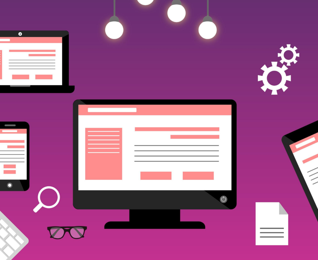
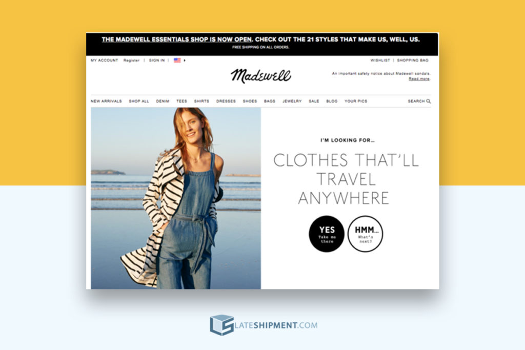
Making your site visually appealing, building intuitive navigation, and making it easy for visitors to make purchases when they’re ready to do so are well-recognized ways to improve on-site customer experience.
Below, however, are some more subtle points that will help you piece together a better on-site customer experience .
Here's What You Need to Do to Piece Together a Better On-Site eCommerce Customer Experience
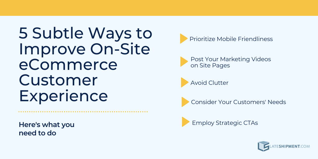
1. Prioritize Mobile Friendliness
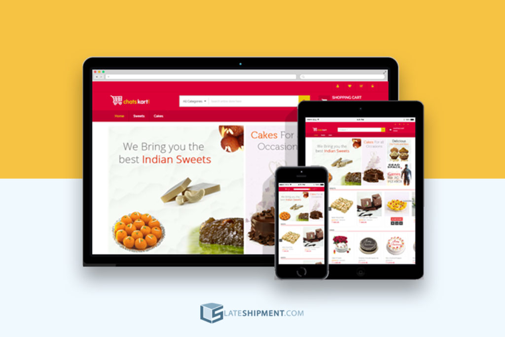
From a design standpoint, this is a relatively simple step to take. But in terms of optimizing your eCommerce site, it’s actually a fairly big deal.
70% of all media time is spent on smart phones and more than 50% of all web traffic comes through it.
This shows that “mobile sites facilitate most online research,” and that mobile shoppers are “obsessed” with researching on their devices.
It is clearly in any eCommerce platform’s best interest to make a good on-site experience extend to mobile use. How this is to be done depends largely on your site’s design and the platform it’s built on.
It is clearly in any eCommerce platform’s best interest to make a good on-site experience extend to mobile use.
Generally though, you want to go beyond just miniaturizing the web experience for mobile. When you do this, scrolling can be tiresome, text can be small, and most importantly, your calls to action can start to blend in (whereas they might “pop” more on your site).
Instead of miniaturizing, consider changing the actual design and layout of your site, at least slightly, as it appears on mobile.
We have two more specific tips for how to do this effectively.
- The first is simply to observe your competitors’ sites, or even sites for products and companies you admire. Take note of how they change their formats between web and mobile viewing.
- Next, we recommend exploring some of the mobile-specific design tools you can find at web building platforms like Wix. Even if you’re not redesigning your whole site, these platforms allow for easy switching between online and mobile layouts.
This makes it easy to tinker with designs and quickly find a few ways to make mobile viewing more appealing.
2. Post Your Marketing Videos on Site Pages
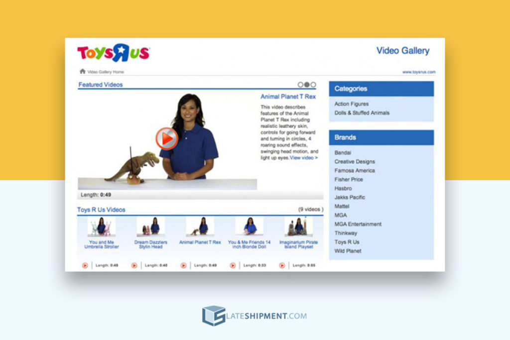
Posting images and/or videos on your website is almost always a good idea. It expands visual appeal, and breaks up blocks of texts, menus, and so on.
Specifically though, we’re recommending you post some of the same videos you might use for marketing purposes on your actual website.
In our “8 Steps to Creating Engaging Video Email Marketing Campaigns”,we discussed how to construct effective videos for purposes of outreach.
In that post, naturally, the idea was to use videos in email marketing.
However, given that marketing videos tend to give peeks of products, or explain what a business is offering in an exciting manner, they can be helpful on your site as well.
Customers will often appreciate the chance to watch brief videos about the businesses and products they’re interacting with as opposed to reading brand missions or combing through product descriptions.
3. Avoid Clutter
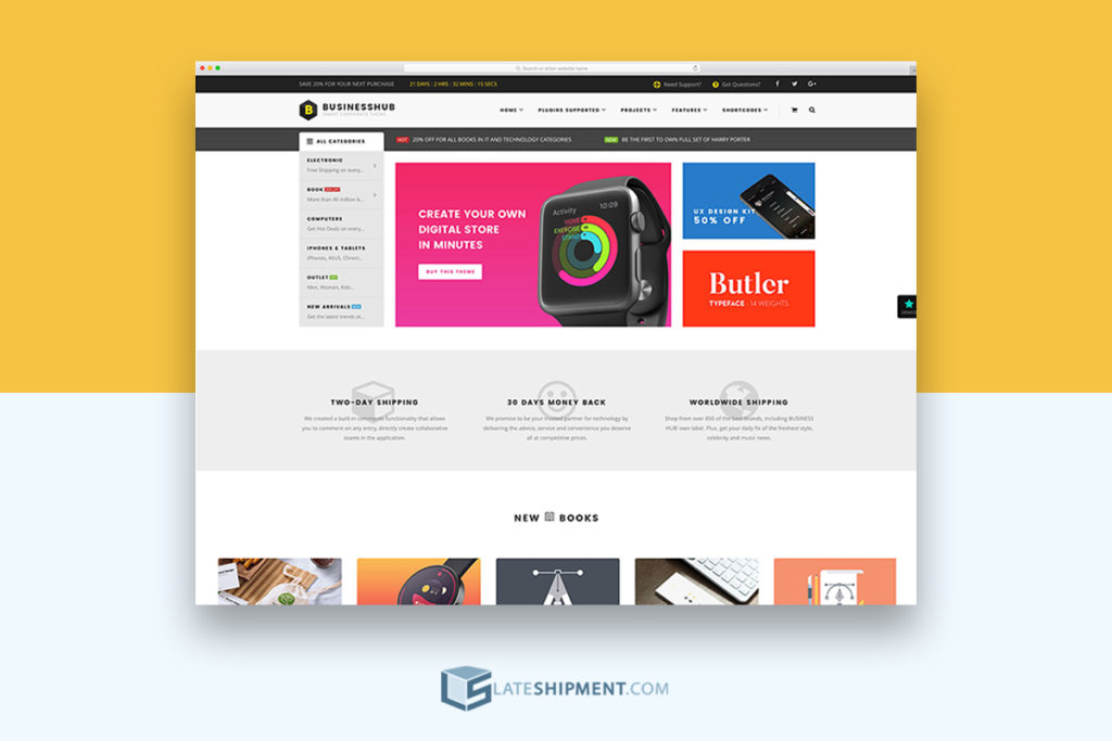
This is somewhat more of a general design tip, but it’s still vital to establishing an attractive on-site customer experience.
Simply put, nothing makes a website less appealing than clutter.
Too much text, content arranged too closely together, a lack of empty space… All of these can contribute to a generally cluttered look, which in turn makes a site look unorganized and poorly managed.
Needless to say, a would-be customer who gets this impression will be more likely to keep browsing elsewhere.
Clutter is about more than just pure visual impression, though. It also has to do with how much content is on your site, and how much of it is necessary.
Forbes discussed website clutter in this context and warned bluntly that your website may be filled with “things your audience doesn’t need or want.”
For example, you might have listings for products you don’t care about anymore.
Your website may be filled with things your audience doesn’t need or want. – Forbes
You might have a page labeled “Page 1 of … 94.” If you find indications like these that your site might simply have too much content on it, it might be time to scale back.
Your site’s visitors probably don’t like having to navigate too much.
The more you can keep your material fresh and somewhat minimalistic, the more likely you’ll be to keep shoppers’ attention.
4. Consider Your Customers' Needs
This is a good idea for any business at any time, and always has been.
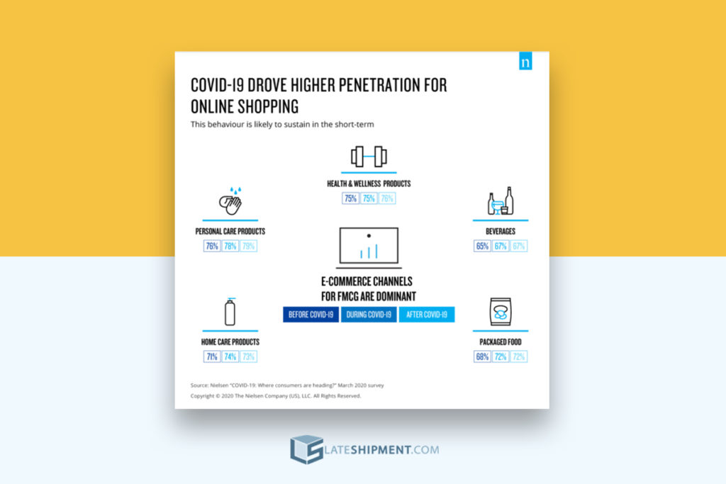
However, with so many changes in business operations and consumer behavior occurring in 2020, it may be time to give some new consideration to how your site is arranged to acknowledge and speak to customer needs.
HP discussed consumer behavior in light of a “global emergency” like the one we’ve seen in 2020 with the COVID-19 pandemic and highlighted one idea that is particularly important for businesses to take to heart: You need to try new ideas, because your competitors surely are.
Your consumers have had to change their way of life, and by extension their ways of doing business with companies like yours, so it’s a good idea to be sensitive to those changes — whether through new language and messaging, offering new services, or anything else similar that’s relevant to your business.
This might mean changing some of your product or service descriptions or your CTAs (which we’ll discuss further below) to explain how your offerings can be useful given the times.
It might mean prominently listing any assurances you can offer regarding safe shipping or product cleanliness.
Whatever the specifics though, your on-site experience can improve with specific regard to 2020 if it’s able to acknowledge people’s present struggles and concerns.
5. Employ Strategic CTAs
Our final tip for improving on-site experience is to employ strategic CTAs.
CTA or “call to action” is defined by The Balance SMB as “a statement designed to get an immediate response from the person reading or hearing it”.
On an eCommerce site, for instance, a CTA might be a clickable phrase like “Buy,” “Click here,” “Order now,” “Checkout,” etc. They are essentially suggestions, but those that — when presented correctly — incentivize action.
Clearly, strategic CTAs can help to generate sales in a fairly direct sense. However, they also make for a better on-site experience.
Strategic CTAs can help to generate sales in a fairly direct sense
Customers tend to appreciate it when things are made clear, and if CTAs are presented well, customers won’t feel pressured so much as guided.
Be wary though of excessive CTA use (which can become another “clutter” issue). However, do make sure CTAs are present and clearly identified.
You should also ask yourself with each CTA you employ if it makes sense where it is. Flooding pages at random with “buy” or “subscribe” links is a good way to make them blend in, and ultimately be ignored.
Instead, put them in logical places.
Perhaps that means having an offer to sign up for updates pinned to your “About” page; maybe it means putting a newsletter subscription button at the base of each piece of content (as opposed to in the margins, at the top, or interrupting the text).
Specifics will depend on your site and style, but always approach CTAs with both restraint and intent.
About the Author
Andy Russell is a freelance business writer who specializes in covering trends in retail. Recently he has been covering the rise of eCommerce and how it is changing the retail landscape. When he is not writing, he likes to play online chess.
A Little about LateShipment.com
LateShipment.com is the world’s only logistics cloud tool that helps businesses of every size reduce shipping costs by up to 20% and provide memorable delivery experiences to customers at scale.
At LateShipment.com, our focus has remained steadfastly on the last mile, typically the part of the logistics chain that is the most opaque.
Some of our high-impact offerings are :
- Shipping Cost Savings (up to 20%) – Automate the audit of your shipping invoices and recover refunds for 50+ service failures & billing errors including late deliveries.
- Real-Time Parcel Tracking – Monitor your outbound & inbound shipments across multiple shipping carriers on a centralized window, in real-time.
- Predictive Delay Alerts – Pay attention to daily deliveries with predictive delay alerts and more on a purpose-built dashboard for support reps.
- Proactive Issue Resolution – Proactively communicate with customers to prevent them from having bad experiences due to delivery failures.
- Delivery Status Notifications – Send custom or automated delivery status notifications to your customers for events like “shipped,” “attempted,” & “delivered.”
- Branded Order Tracking – Build fully-customizable order tracking pages for your customers to improve brand recall and sales.
- Delivery Experience Feedback – Gather feedback from customers about their delivery experience. Measure and optimize shipping operation
The best part is, it takes less than 2 minutes to see LateShipment.com in action.
The value we add to businesses is most evident when experienced first-hand. Try LateShipment.com now.